
I have restarted the analyses since early July 2020 with the new Melbourne outbreak. The logic behind these charts is that they fill an information gap. Official data sources only give historic data series, and mainstream media typically only give near term predictions based on opinion.
Chart update 21 July 2020
What’s new?
Today’s new number of cases, 388 as per the Australian Department of Health 21/7/2020 update, is very consistent with the estimate from the projections of the model. We are now approaching two weeks into the stage 3 restrictions (“lock down”) of Melbourne, which started on 9 July 2020. I am increasingly concerned that transmission has not been adequately suppressed.
Although the growth in new cases over the past week has no longer been consistent with “exponential” growth (in contrast to early July where new case counts fit very well within an exponential series), it does not appear from the model that we are approaching the “peak” of new cases soon.
My experience with this model from the March 2020 was that projections from early on in the epidemic tend to underestimate slightly in the short-term (days), and overestimate in the longer-term (weeks). This bias is something to keep in mind.
Projection of new daily cases of COVID-19 with data up to 21 July 2020

What is this?
The image is a chart of the confirmed daily new cases of COVID-19 in Australia, with a projection for the next 2 weeks. The projection is made using a model by fitting the data since 1 June 2020 to a Gompertz equation using non-linear regression. The dark blue dashed line is the model estimate. The grey dashed lines are the 95% prediction intervals, with the values given at 7 and 14 days into the future. The blue gradations can be understood as the degree of uncertainty in the model projections.
“Gompertz” equation?
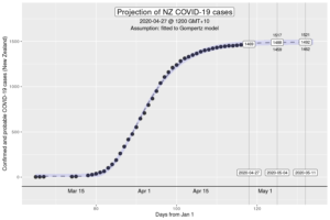
The Gompertz function is a type of sigmoid, or “S”-shaped curve. It’s been around since the early 19th century and was initially used to describe and model demographic mortality curves, and hence, well known to actuaries. The Gompertz function can also be used to accurately model biological growth (e.g., epidemics, tumour size, enzymatic reactions). Early in the pandemic, it was identified that it was useful in modelling cumulative cases of COVID-19 from the Chinese outbreaks (Jia et al. arXiv:2003.05447v2 [q-bio.PE]). My experience from the initial outbreak from earlier in the year is that this was also the case in Australia and New Zealand (for instance, NZ data below).
How have the model projections changed over the month?
The video demonstrates how the projections have evolved over time as new daily data have become available. This can give a better sense of where we are headed, given that the model cannot account for changes in context (e.g., policy changes, changes in testing rates, etc.)
My interpretation
The data over the past month is consistent that a new outbreak, with the growth in cases initially in the “exponential” phase. The growth has slowed down since that initial rapid growth. However, outbreaks don’t really grow exponentially so at a certain level, this is neither surprising nor indicative that transmission has been overcome. Gompertz models better describe the growth, but there is a lot of uncertainty in future projections from early data.
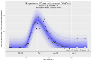
The Australian and New Zealand experience of the March-April outbreak give us perhaps the best indication of what the curve “should” look like if policies to reduce transmission of coronovirus is effective. For both Australia and New Zealand, daily new case counts reached its peak roughly a week after the implementation of “lock down” policies. Of concern, we are now twelve days into the Melbourne lock down, and there is still no evidence of having reached the zenith of new cases (see the top chart). My personal expectation is that I would have expected to see some evidence of the model projections consistently over-estimating as the actual new cases hit their peak, and then, the model correcting with the new data and giving more accurate projections “down the hill” as new daily cases drop (see chart below). This is what we saw in the first wave.
Below is a chart using the same methodology from during the period March to April, as compared to the current outbreak. As a reminder, the first “lock down” started on 23 March 2020.
Projections of new daily cases of COVID-19 from March-April outbreak compared to the current July outbreak, at 10 days after lock down

Notably, this chart from the first wave is remains very different from the projections today.
The current July data continues to be consistent with the model projections without any suggestion that we’ve crossed, or are even approaching the peak. This has me concerned that current policies might not be sufficiently reducing transmission. Each additional day with data that is consistent with the current projections of the model, increases the confidence we have that the model will adequately describe near future case counts. Effectively, we are “catching up with the future”.
Of major concern are the increasing daily number of cases in NSW at multiple locations across Sydney and the state. The most parsimonious explanation is hidden community transmission, originating from the Melbourne outbreak. Assuming that the recent number of daily new cases is representative of the coming days, and the fact that detection today relates to a transmission event at least 4 or 5 days prior, it is plausible if not probable that there are at least a hundred, if not hundreds of people in NSW who are currently infected with coronavirus, but yet to be identified.
More information about the “peak” in new cases
So according to the current model, when will the peak arrive? My interpretation is that it is extremely unclear, other than it doesn’t appear to be in the near term (next 1-2 weeks). If we naively accept the model projection estimates into the medium and longer term, the peak in new cases appears to be a month away in mid- to late-August at around 700 new cases per day. This estimate should only be taken with extreme caution as what might happen if we don’t make any policy responses at all, which is politically and socially implausible over this timeframe.

What does it mean to have reached the peak in new cases? It’s important to recognise that although this is a welcome milestone in an outbreak, it is not the “half-way point”, which might be the intuition. The peak in the “new cases” curve corresponds to the “inflexion point” on the S-shaped culmulative cases curve (e.g., the first chart of the NZ cases in the brief description on the “Gompertz equation”. Roughly, the peak in new cases occurs at 40% of the total culmulative cases in an outbreak. That means that at the time we hit the peak, we can expect another one-and-a-half times the number of cases so far in the outbreak, before it ends. The insight is that we must resist the psychological temptation to relax transmission control mechanisms simply because we “crossed the peak”.
Want to know more?
Primary data source is the Australian Government Department of Health COVID-19 website for daily new cases. Analysis done using RStudio Cloud.
Today’s charts
Projection based on data up to 2 April 2020
Data: 20200427 – COVID_AU-world
R code: covid_au-world-21