
I restarted the analyses from early July 2020 with the onset of the new Melbourne outbreak. The logic behind these charts is that they fill an information gap. Official data sources only give historic data series, and mainstream media typically only give near term predictions based on opinion.
Chart update 31 July 2020
What’s new?
Today’s new number of cases, 651 as per the Australian Department of Health 31/7/2020 update is again, much higher than the projected estimate of the model. This is the second day in a row. Yesterday’s extraordinary high of 747 cases has been revised down to 698. My understanding on why there is this daily down revision is that a proportion of “new” positive detections are actually from known cases (for instance, duplicated tests, or repeat tests of an existing case). The explanation for the large number of new cases over the past two days is not clear to me at the time of this update, but it is concerning. As expected, there is a slight uptick in the model projections as a result.
We are now three weeks into the stage 3 restrictions (“lock down”) of Melbourne, which started on 9 July 2020. According to the model, the peak in new cases is about one-and-a-half to two weeks away. I am concerned at how “wide” the peak appears. An implication of this is that if transmission suppression is not improved, new case counts may take a long time to lower even after growth has plateaued. If some of the policies commenced in Melbourne are effective at reducing transmission further (e.g., mandatory use of face coverings, and enhanced monitoring of home isolation/quarantine compliance), the model will be providing over-estimates. Notwithstanding the past two day’s case counts, the trend in the changes in the model has been a lowering of estimates over the past week. This is best seen in the animation below.
My experience with this model from the March 2020 was that projections from early on in the epidemic tend to underestimate slightly in the short-term (days), and overestimate in the longer-term (weeks). This bias is something to keep in mind.
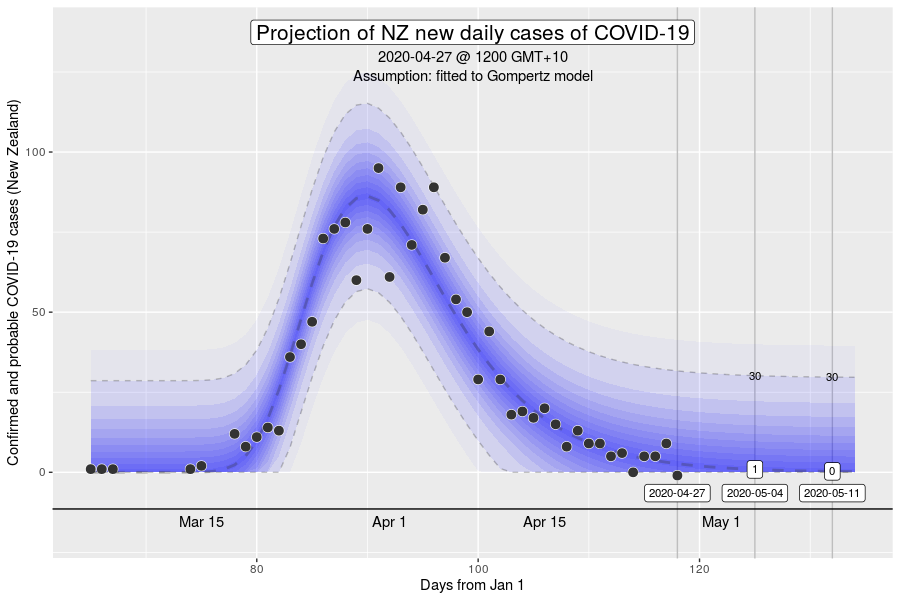
Projection of new daily cases of COVID-19 with data up to 31 July 2020

What is this?
The image is a chart of the confirmed daily new cases of COVID-19 in Australia, with a projection for the next 2 weeks. The projection is made using a model by fitting the data since 1 June 2020 to a Gompertz equation using non-linear regression. The dark blue dashed line is the model estimate. The grey dashed lines are the 95% prediction intervals, with the values given at 7 and 14 days into the future. The blue gradations can be understood as the degree of uncertainty in the model projections.
“Gompertz” equation?
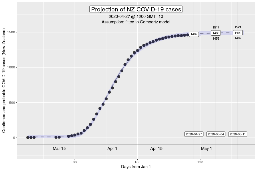
The Gompertz function is a type of sigmoid, or “S”-shaped curve. It’s been around since the early 19th century and was initially used to describe and model demographic mortality curves, and hence, well known to actuaries. The Gompertz function can also be used to accurately model biological growth (e.g., epidemics, tumour size, enzymatic reactions). I have chosen to use this model to help with creating insights as earlier in the pandemic, it was found to be useful in modelling cumulative cases of COVID-19 from the Chinese outbreaks (Jia et al. arXiv:2003.05447v2 [q-bio.PE]). My experience from the initial outbreak from earlier in the year was that this equation gave reasonable descriptions of Australian and New Zealand data (for instance, NZ data below).
How have the model projections changed over the month?
The video demonstrates how the projections have evolved over time as new daily data have become available. This can give a better sense of where we are headed, given that the model cannot account for changes in context (e.g., policy changes, changes in testing rates, etc.)
My interpretation
The case counts from today and yesterday are shockingly higher than expected. Why this is the case isn’t clear to me and we’ll need to watch the upcoming new case numbers closely. In the past week, the model has either remaining stable or has lowered its projections on a day-to-day basis. The trend has been that the model projections have lowered overall. Today, there was a slight uptick in the projections. One or two days of data aren’t a trend, but it’s starting to feel a bit uncomfortable. In context, we’re approaching 10,000 cases since June 1 of which over 1,200 were just in the last two days.
There remains concern with the daily number of cases in NSW at multiple locations across Sydney and the state. New daily numbers haven’t climbed in the past week, but also haven’t whittled away. I think the phrase “on a knife’s edge” has been used to describe the situation in NSW. Widespread testing and contact tracing is taking place, along with improving physical distancing adherence and use of masks. Hopefully, it will be enough.
More information about the “peak” in new cases
What does it mean to have reached the peak in new cases? Assuming that our suppression of transmission doesn’t become MORE effective after the peak, it’s important to recognise that it is not the “half-way point”, which might be the intuition. The peak in the “new cases” curve corresponds to the “inflexion point” on the S-shaped culmulative cases curve (e.g., the first chart of the NZ cases in the brief description on the “Gompertz equation”. Roughly, the peak in new cases occurs at 40% of the total culmulative cases in an outbreak. That means that at the time we hit the peak, we can expect another one-and-a-half times the number of cases so far in the outbreak, before it ends. The insight is that we must resist the psychological temptation to relax transmission control mechanisms simply because we “crossed the peak”.
Want to know more?
Primary data source is the Australian Government Department of Health COVID-19 website for daily new cases. Analysis done using RStudio Cloud using R version 4.0.2.