
I restarted the analyses over a month ago with the onset of the new Melbourne outbreak in July 2020. The logic behind these charts is that they fill an information gap. Official data sources only give historic data series, and mainstream media typically only give near term predictions based on opinion.
Chart update 9 August 2020
What’s new?
I’m excited. We are finally approaching the peak number of new cases in the outbreak. We are now one week into the stage 4 restrictions. Over the past 7 days, the model projections were overestimates on 6 of those days. This has brought the peak in the model projections closer and lower. Including today’s new number of cases, 404 as per the Australian Government Department of Health 9/8/2020, the model projects that the peak of the underlying trend will be in 2 days. Given the inherent uncertainty in the model, I feel reasonably confident that the peak will occur within the next week. There even some possibility that it might have already passed in the last couple of days. This is best seen in the main chart, and the “smoothing” chart at the bottom of the page.
It should be noted that case counts have been “lumpy” when considered at a daily level, bouncing up and down. However, unless we have a run of much higher than expected cases in the coming days, it is not likely that the projection will change.
Stage 3 restrictions started in Melbourne on 9 July 2020, and stage 4 restrictions commenced on 2 August 2020. The move to stage 4 can be considered an acknowledgement that at a whole of system level, “stage 3” was insufficiently reducing transmission. I’ve noted for the past week that if stage 4 restrictions reduce transmission, what we should see at the earliest at around a week is the model progressively over-estimating case counts. We might be starting to see exactly this phenomenon now.
My experience with this model from the March 2020 was that projections from early on in the epidemic tend to underestimate slightly in the short-term (days), and overestimate in the longer-term (weeks). This bias is something to keep in mind.
Projection of new daily cases of COVID-19 with data up to 9 August 2020

What is this?
The image is a chart of the confirmed daily new cases of COVID-19 in Australia, with a projection for the next 2 weeks. The projection is made using a model by fitting the data since 1 June 2020 to a Gompertz equation using non-linear regression. The dark blue dashed line is the model estimate. The grey dashed lines are the 95% prediction intervals, with the values given at 7 and 14 days into the future. The blue gradations can be understood as the degree of uncertainty in the model projections.
“Gompertz” equation?
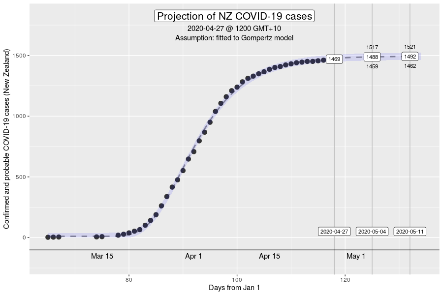
The Gompertz function is a type of sigmoid, or “S”-shaped curve. It’s been around since the early 19th century and was initially used to describe and model demographic mortality curves, and hence, well known to actuaries. The Gompertz function can also be used to accurately model biological growth (e.g., epidemics, tumour size, enzymatic reactions). I have chosen to use this model to help with creating insights as earlier in the pandemic, it was found to be useful in modelling cumulative cases of COVID-19 from the Chinese outbreaks (Jia et al. arXiv:2003.05447v2 [q-bio.PE]). My experience from the initial outbreak from earlier in the year was that this equation gave reasonable descriptions of Australian and New Zealand data (for instance, NZ data below).
How have the model projections changed over the month?
The video demonstrates how the projections have evolved over time as new daily data have become available. This can give a better sense of where we are headed, given that the model cannot account for changes in context (e.g., policy changes, changes in testing rates, etc.)
My interpretation
There has been a welcome down tick again in the model projections. The peak in new cases is estimated to be in two days. Even if the recent data are underestimates due to the “lumpiness” in reporting and we have another day or two of high case numbers, the peak will still likely occur in the next week. On the other hand, if the recent lower than projected case counts are related to a decline in transmission from recent policy changes (e.g., stage 4 restrictions, and mandatory face coverings prior), it is plausible that the peak in cases may have already occurred. Given the daily variation in the data, this will only be clear retrospectively with the inclusion of data on the “other side” of the peak.
As noted for about a couple of weeks now, the “width” of the peak under stage 3 restrictions was a major concern. If transmission suppression is not improved, new case counts may take a long time to lower even after growth has plateaued. On a cumulative case chart, this would appear as a period of relatively linear growth. Indeed, this was the rationale for the stage 4 restrictions. At the time stage 4 restrictions were introduced (2 August 2020), the model estimate for the total number of cases from the Melbourne outbreak over the whole course was roughly 50,000. This assumed that transmission dynamics remain stable under stage 3 conditions at a whole of system perspective. This number has been dropping in the past week, and today, the estimate is 40,000, and I’m reasonably confident that will be a substantial overestimate to what will be the reality. For context, there have been just under 14,000 confirmed cases of COVID-19 in Australia since 1 June 2020, the vast majority in Victoria.
New daily numbers haven’t climbed in the past fortnight in NSW, but also haven’t whittled away either. With the widespread testing and contact tracing, and improving physical distancing adherence and use of masks, I am hopeful that we won’t see a major outbreak in Sydney.
More information about the “peak” in new cases
What does it mean to have reached the peak in new cases? Assuming that our suppression of transmission doesn’t become MORE effective after the peak, it’s important to recognise that it is not the “halfway point”, which might be the intuition. The peak in the “new cases” curve corresponds to the “inflexion point” on the S-shaped cumulative cases curve (e.g., the first chart of the NZ cases in the brief description on the “Gompertz equation”. Roughly, the peak in new cases occurs at 40% of the total cumulative cases in an outbreak. That means that at the time we hit the peak, we can expect up to another one-and-a-half times the number of cases so far in the outbreak, before it ends. The insight is that we must resist the psychological temptation to relax transmission control mechanisms simply because we “crossed the peak”. Indeed, crossing the peak is an opportunity to increase the intensity in tranmission control as the system has now developed increased capacity. Doing so may accelerate the drop in new cases.
More information about “moving averages”
Several people have requested adding “moving averages” on the charts. This is not something that I will include in the main chart and video, so I wanted to provide an explanation. Moving averages are a type of “smoothing” algorithm. This is potentially useful as the daily fluctuations in the case numbers are less interesting, than the underlying pattern of growth. Daily fluctuations relate to system effects such as batching in testing and reporting, while the underlying trend relate to the transmission dynamics of COVID-19 in the community.
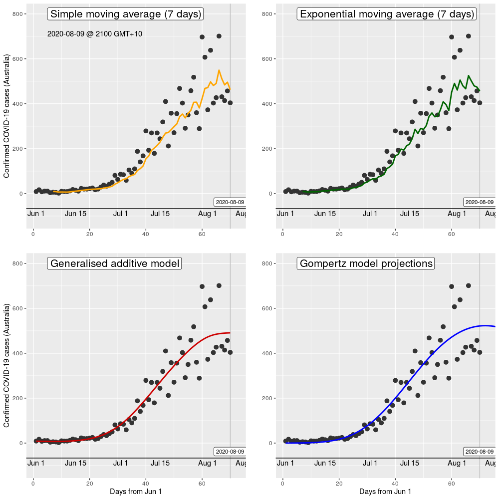
So, this sounds pretty useful?! The problem is that moving averages are a rather crude method of smoothing. It doesn’t matter whether we use simple moving averages or exponential moving averages (which give greater weight to more recent data). Other more sophisticated (and in my opinion, rather better) smoothing algorithms can/should be used such as cubic splines, LOESS, or a general additive model. Examples of these are in the below comparative chart.
However, something to notice is that the model that has been used to create projections (the aforementioned Gompertz equation) does a really good job at providing a “smoothing” of the existing data points. It is a very close fit to the smoothed trend using the GAM. This is good as it implies that the model does a reasonable job at describing the known existing data – if it didn’t do this then we shouldn’t have any confidence that the model would provide reasonable future projections. Basically, there is no point in providing “moving averages” in addition to the actual data points other than cluttering the chart with less useful information.
Smoothing methods (SMA vs EMA vs GAM) of case numbers, compared to model projections with data up to 9 August 2020
Want to know more?
Primary data source is the Australian Government Department of Health COVID-19 website for daily new cases. Analysis done using RStudio Cloud using R version 4.0.2.