
I restarted the analyses in early July with the onset of the new Melbourne outbreak in July 2020. The logic behind these charts is that they fill an information gap. Official data sources only give historic data series, and mainstream media typically only give near term predictions based on opinion.
Chart update 12 August 2020
What’s new?
Today’s new number of cases, 429 as per the Australian Government Department of Health on 12/8/2020, is again lower than the estimate of the model projections. The model has been consistently over-estimating case counts in the past week, which is what we would expect to see if there is a change (for the better) in transmission dynamics. This is plausibly the result of stage 4 restrictions (which commenced on 2 August 2020) as well as policies such as mandatory face coverings which were implemented earlier. Basically, we are “bending the curve” down. Excellent!
The 7 and 14 day projections of the Gompertz model are very likely to be incorrect at present and should not be taken seriously for the time being. A comparison of the various “smoothing” methods of the data with the model projections demonstrate this overestimation well. This is best seen between the trend line using the generalised additive model method (red) vs the Gompertz model (blue).
Smoothing methods (SMA vs EMA vs GAM) of case numbers, compared to model projections with data up to 12 August 2020

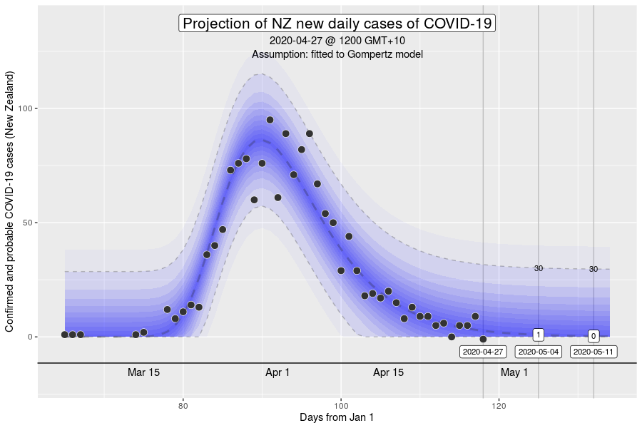
My experience with this model from the March 2020 was that projections from early on in the epidemic tend to underestimate slightly in the short-term (days), and overestimate in the longer-term (weeks). This bias is something to keep in mind. For the sake of continuity, I’ve updated the Gompertz model chart to include today’s data as well.
Projection of new daily cases of COVID-19 with data up to 12 August 2020

What is this?
The image is a chart of the confirmed daily new cases of COVID-19 in Australia, with a projection for the next 2 weeks. The projection is made using a model by fitting the data since 1 June 2020 to a Gompertz equation using non-linear regression. The dark blue dashed line is the model estimate. The grey dashed lines are the 95% prediction intervals, with the values given at 7 and 14 days into the future. The blue gradations can be understood as the degree of uncertainty in the model projections.
“Gompertz” equation?
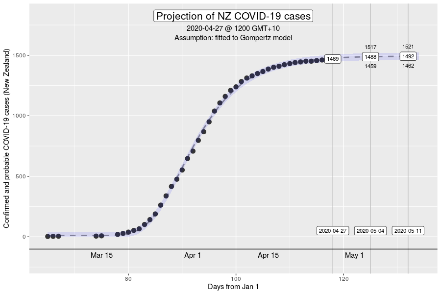
The Gompertz function is a type of sigmoid, or “S”-shaped curve. It’s been around since the early 19th century and was initially used to describe and model demographic mortality curves, and hence, well known to actuaries. The Gompertz function can also be used to accurately model biological growth (e.g., epidemics, tumour size, enzymatic reactions). I have chosen to use this model to help with creating insights as earlier in the pandemic, it was found to be useful in modelling cumulative cases of COVID-19 from the Chinese outbreaks (Jia et al. arXiv:2003.05447v2 [q-bio.PE]). My experience from the initial outbreak from earlier in the year was that this equation gave reasonable descriptions of Australian and New Zealand data (for instance, NZ data below).
How have the model projections changed over the month?
The video demonstrates how the projections have evolved over time as new daily data have become available. This can give a better sense of where we are headed, given that the model cannot account for changes in context (e.g., policy changes, changes in testing rates, etc.)
My interpretation
There is a clear and substantial change in trajectory in the model projections in the past few days. This is great. The evolution of the model now as it incorporates the new data means that it is likely that the model performance is currently poor – it is very likely that the model projections into the future are substantial overestimates. My experience with doing the same analyses in March-April is that the model should improve again with more data, but the precision will be low (i.e., wide prediction intervals). If the transmission dynamics moving forward is very different to that in the past (for instance, during stage 3 restrictions), it is possible that the model will simply not be a good description of the case series taken as a whole. In such a setting, it would simply be better to “retire” the model. This will likely become obvious over the next week.
New daily numbers haven’t climbed in the past fortnight in NSW, but also haven’t whittled away either. With the widespread testing and contact tracing, and improving physical distancing adherence and use of masks, I am hopeful that we won’t see a major outbreak in Sydney.
More information about “moving averages”
Several people have requested adding “moving averages” on the charts. This is not something that I will include in the main chart and video, so I wanted to provide an explanation. Moving averages are a type of “smoothing” algorithm. This is potentially useful as the daily fluctuations in the case numbers are less interesting, than the underlying pattern of growth. Daily fluctuations relate to system effects such as batching in testing and reporting, while the underlying trend relate to the transmission dynamics of COVID-19 in the community.
So, this sounds pretty useful?! The problem is that moving averages are a rather crude method of smoothing. It doesn’t matter whether we use simple moving averages or exponential moving averages (which give greater weight to more recent data). Other more sophisticated (and in my opinion, rather better) smoothing algorithms can/should be used such as cubic splines, LOESS, or a general additive model. Examples of these are in the below comparative chart.
However, something to notice is that the model that has been used to create projections (the aforementioned Gompertz equation) does a really good job at providing a “smoothing” of the existing data points. It has been a very close fit to the smoothed trend using the GAM, as least, until about a week into stage 4 restrictions.
Want to know more?
Primary data source is the Australian Government Department of Health COVID-19 website for daily new cases. Analysis done using RStudio Cloud using R version 4.0.2.