
I restarted the analyses in early July 2020 with the onset of the new Melbourne outbreak. The logic behind these charts is that they fill an information gap. Official data sources only give historic data series, and mainstream media typically only give near term predictions based on opinion.
Chart update 4 September 2020
What’s new?
It has been one week since the last chart. The projections have remained steady with an overall decline in new daily case numbers. The model based on fitting data to a Richards’ growth curve, also known as the generalised logistic function, continues to be performing well. Today’s new number of cases, 89 as per the Australian Government Department of Health on 4/9/2020 is mostly consistent with the model estimate.
The Richards’ growth curve model since mid-August had projected that we would likely see less than 100 new daily cases at the end of August. This occurred on 31 August 2020.
Of some concern, the number of new cases over the past 3 days have been higher than the projections. It is too early to be clear, but there is some possibility that the decline in cases has slowed.
Projection of new daily cases of COVID-19 with data up to 4 September 2020

What is this?
The image is a chart of the confirmed daily new cases of COVID-19 in Australia, with a projection for the next 2 weeks. The projection is made using a model by fitting the data since 1 June 2020 to a Richards’ growth curve using non-linear regression. The dark green dashed line is the model estimate. The grey dashed lines are the 95% prediction intervals, with the values given at 7 and 14 days into the future. The green gradations can be understood as the degree of uncertainty in the model projections. This model was introduced on 13 August 2020, replacing the previous model that fitted data to a Gompertz equation.
“Richards’ growth curve”? “Gompertz equation”?
Those who have been following these charts would know that the original model was constructed by fitting the cumulative daily case numbers to a Gompertz equation. This is an “S-shaped” or sigmoid curve. There were two rationales in doing this. The first is that the Gompertz function describes well certain types of biological growth, including epidemics. The equation itself is the solution to a specific differential equation that has some plausibility with regards to case growth in an epidemic. The second more empirical rationale is that Chinese authors found that the Gompertz equation appeared to describe the growth of COVID-19 cases in parts of China (Jia et al. arXiv:2003.05447v2 [q-bio.PE]). I personally found this was the case in the March-April outbreaks in Australian and New Zealand.
However, the Gompertz equation does have limitations. For one, the inflexion point of the curve is fixed. The inflexion point is where we would see the peak number of new cases a day. This is well demonstrated in the NZ outbreak of March 2020 (see below).
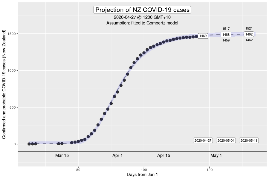
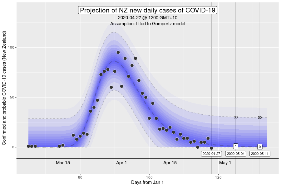
The inflexion point of the Gompertz function at 37% of the final total number of cases in an outbreak (exactly at the ratio of 1 to (e-1), where e is Euler’s number). While this is what we might expect in an outbreak where the growth dynamics remains relatively constant, it will be a poor description if the intensity of interventions to control transmission increases over time (e.g., with the stage 4 restrictions).
The Richards’ growth curve (or the generalised logistic function) is a broad family of sigmoid curves, and can describe curves with inflexion points that vary. It too has been demonstrated to have utility in modelling COVID-19 outbreaks (Lee et al. PLoS One 2020 doi: 10.1371/journal.pone.0236860). A consequence of this freedom, however, is that IF data is well describe by the Gompertz equation, there will be greater uncertainty and statistical error using a Richards’ curve. This is not just a theoretical concern. When I use the Richards’ growth curve to model data from earlier in the Melbourne outbreak, it tends to result in very wide prediction intervals in near future projections, with an estimate that biases towards under-estimates. Effectively, projections from a Richards’ growth curve using early data result in overly optimistic estimates of how soon the inflexion point or the “peak” will come.
So why now? Firstly, we have crossed the peak/passed the inflexion point already. My intuition is that the more flexible nature of the Richards’ curve now that data exists for a larger range of the curve, will lead to much better performance than using a similar method with the Gompertz equation. Moreover, it is clear that the projections from the Gompertz equation are not credible in the near future, due to it’s fixed inflexion point, and that the actual case curve has been “bent down” through interventions.
Comparison between the Gompertz and Richards’ growth curve model projections, along with smoothed data trends (moving average vs GAM) with data up to 4 September 2020
 Note: simple moving average and the generalised additive model can be considered to be smoothing methods of the raw data and no future projections are given (or meaningful). The coloured shaded areas on the three charts are the 95% confidence interval of the mean. These can be interpreted as the range of values that are mathematically compatible with the estimate of the mean. The wide confidence intervals on the Gompertz model when compared to the generalised additive smoothing trend indicates the poor fit of the Gompertz model with the data.
How have the model projections changed over the month?
The video demonstrates how the projections have evolved over time as new daily data have become available. This can give a better sense of where we are headed, given that the model cannot account for changes in context (e.g., policy changes, changes in testing rates, etc.) Please note the model change that occurred on 13 August 2020 (Gompertz = blue, Richards’ = green).
My interpretation
There has been a clear downward trajectory after the implementation of stage 4. The Richards’ growth model has largely captured this well. Assuming that the trajectory continues, it is probable that the total size of the outbreak (count starting from 1 June 2020) will be around 19 thousand cases.
Want to know more?
Primary data source is the Australian Government Department of Health COVID-19 website for daily new cases. Analysis done using RStudio Cloud using R version 4.0.2.
Today’s charts
Data: au_covid
R code: richards_model