
I have restarted the analyses since for about a week with the new Melbourne outbreak. The logic behind these charts is that they fill an information gap. Official data sources only give historic data series, and mainstream media typically only give near term predictions based on opinion.
Chart update 17 July 2020
What’s new?
Today’s new number of cases, 438 as per the Australian Department of Health 17/7/2020 update (note: the daily estimate has reliably been reduced the next day recently), represents an uptick in cases that is larger than the projection of the model, as a single data point. Whether this is a one off, or whether this represents underlying ongoing growth in cases should become obvious in the next few days. Although it might not be so clear visually, the growth in new cases over the past week has not been consistent with “exponential” growth, which is what we often see early in an outbreak, especially if there is uncontrolled community transmission. This is in contrast with the growth in new cases in early July that fit very well within an exponential series.
My experience with this model from the March 2020 was that projections from early on in the epidemic tend to underestimate slightly in the short-term (days), and overestimate in the longer-term (weeks). This bias is something to keep in mind.
Projection of new daily cases of COVID-19 with data up to 17 July 2020

What is this?
The image is a chart of the confirmed daily new cases of COVID-19 in Australia, with a projection for the next 2 weeks. The projection is made using a model by fitting the data since 1 June 2020 to a Gompertz equation using non-linear regression. The dark blue dashed line is the model estimate. The grey dashed lines are the 95% prediction intervals, with the values given at 7 and 14 days into the future. The blue gradations can be understood as the degree of uncertainty in the model projections.
“Gompertz” equation?
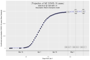
The Gompertz function is a type of sigmoid, or “S”-shaped curve. It’s been around since the early 19th century and was initially used to describe and model demographic mortality curves, and hence, well known to actuaries. The Gompertz function can also be used to accurately model biological growth (e.g., epidemics, tumour size, enzymatic reactions). Early in the pandemic, it was identified that it was useful in modelling cumulative cases of COVID-19 from the Chinese outbreaks (Jia et al. arXiv:2003.05447v2 [q-bio.PE]). My experience from the initial outbreak from earlier in the year is that this was also the case in Australia and New Zealand (for instance, NZ data below).
How have the model projections changed over the month?
The video demonstrates how the projections have evolved over time as new daily data have become available. This can give a better sense of where we are headed, given that the model cannot account for changes in context (e.g., policy changes, changes in testing rates, etc.)
My interpretation
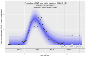
The data over the past month is consistent that a new outbreak, with the growth in cases initially in the “exponential” phase. The growth is starting to slow down, notwithstanding today’s higher than expected case count. Outbreaks don’t really grow exponentially so at a certain level, this isn’t surprising, but it is welcome. Gompertz models better describe the growth, but there is a lot of uncertainty in future projections from early data. In effect, it’s too early to call whether the daily new case count is going to “peak” soon (or possibly has peaked), or whether this is still consistent with ongoing community transmission in the Australian context, on the basis of the statistical model. For instance, if we look at the “peak” in the March-April outbreak in New Zealand, which likely occurred at around April 1 when analysed retrospectively, new case counts bounced up and down or several days afterwards this point.
Today’s case count is of some concern, especially if we continue to have higher than expected new cases in the next few days. Nonetheless, there is reason to hope. Melbourne went into “lock down” at midnight at the start of 9 July 2020. Assuming that the outbreak is limited to Melbourne, we should expect to see the peak incidence of new daily cases after roughly a week. This was what occurred after the national “lock down” that started 23 March 2020, and this probably provides the best guide of what we might expect.
The big unknown is the degree of community transmission from people who have travelled from Melbourne to other parts of Australia in the past 2 weeks. If this has occurred, it is likely that we’ll start to see new outbreaks in other parts of Victoria and in the other states. There is an established cluster in South Western Sydney with ongoing new daily cases, that is of significant concern. At the moment, there hasn’t been compounding growth of cases identified in South Western Sydney, which might be a good sign.
Want to know more?
Primary data source is the Australian Government Department of Health COVID-19 website for daily new cases. Analysis done using RStudio Cloud.